The New Premium
The journey of how we designed a new HMI language for the XC70 — rooted in Scandinavian heritage, guided by safety and clarity, and shaped to define the future of premium at Volvo Cars.
Role
UX Director
Stakeholders
Global UX Head | Visualization Director | Design VP | Product & Strategy VP | Engineer Parterners | Commercial

Background
From Form to Function, a Scandinavian Balance
For the new XC70, our ambition was to craft a new HMI design language that could set the direction for Volvo Cars’ future of premium. We drew deeply from Scandinavian values — clarity, simplicity, and timeless elegance — while staying true to Volvo’s uncompromising commitment to safety.
The challenge was to create an experience that felt calm yet innovative, restrained yet poetic. Technology had to serve human values, delivering information clearly and efficiently while also offering a premium, modern expression of Scandinavian design.
Exploration
Research and Inspirations
We started with looking at what we had in hand — the existing HMI patterns, visual elements, and interaction flows across our current portfolio. This gave us a clear picture of both the strengths to build on and the limitations to overcome.

Early Explorations
From there, we expanded our horizon: studying global design trends, drawing inspiration from Scandinavian aesthetics, and analyzing how form and function had been balanced in both digital and physical product design. This exploration was not only about identifying what worked elsewhere, but also about understanding what felt authentic to Volvo.
As we gathered insights, one guiding question kept emerging: how can we create an HMI language that feels premium, yet unmistakably Scandinavian? This became the compass for the journey ahead, shaping the direction for our design principles and the keywords that would later define our language.

Definition
Defining the Path Forward

As our exploration matured, the next step was translating these insights into a tangible design system. We didn’t want to redefine Volvo’s values; we wanted to express them through HMI in a way that was both precise and forward-looking.
This led us to establish a visual foundation we called “Blueprint” — a rational and precise style that embodies clarity, control, and Scandinavian restraint. More than just a design direction, Blueprint became the anchor from which the entire system could evolve, ensuring consistency today while leaving space for innovation tomorrow.
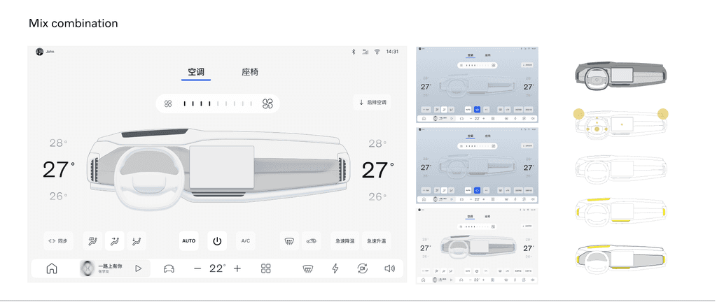
Three Visualization Tiers
To create a system that is both versatile and distinctly premium, we defined three complementary visual styles. Each serves a unique role within the user experience, balancing emotion, clarity, and functionality.

The realistic style delivers immersive, emotionally engaging experiences where spatial awareness is essential. It is used in contexts such as the launcher, where users are welcomed into the system, and in driving-related views like ADAS and parking, where depth and realism enhance trust and comprehension.

Inspired by the precision of technical manuals and rooted in Scandinavian rationality, the blueprint style emphasizes clarity, control, and hierarchy. With its clean graphic lines and ordered structure, it communicates information with maximum legibility, embodying the principle that true functionality can be inherently beautiful.

The hybrid style represents a sophisticated fusion of realism and blueprint. Deployed in select scenarios such as Charging and Ambient Lighting controls, it combines atmospheric visualization with precise adjustment mechanisms. The result is a mode that balances emotional resonance with practical usability.
Refinement
From Principles to Practice
We iteratively turned principles into system artifacts and validated their fit at multiple levels.
Visual system
A restrained palette, typographic scale, and spacing rules to improve readability and reduce clutter.
Grid and layout rules that preserve legibility across screen sizes and viewing distances.
Iconography simplified to essential meanings; imagery used sparingly and purposefully.
Interaction & information architecture
Streamlined flows that reduce steps for common tasks and keep critical info accessible.
Consistent interaction patterns (controls, gestures, confirmations) and state behavior to reduce surprises.
Progressive disclosure for non-critical information to lower cognitive load.
Motion & transitions
Motion system defining timing, easing, and choreography to create cinematic, yet efficient transitions.
Motion used as signposting — to indicate hierarchy changes, context shifts, or mode transitions — not as decoration.
A set of “signature moments” where bolder motion or spatial treatments reinforce premium feel.
Polishing, Elevating and Grounding
Beyond system principles, we invested heavily in the fine details that shape how the experience feels. Typography spacing, icon weights, color contrast, and motion timing were continuously refined to strike a balance of clarity and elegance.
Every adjustment — whether in the rhythm of a transition or the curvature of an icon — became an opportunity to reinforce Scandinavian restraint and premium craftsmanship. These micro–refinements ensured the HMI language was not only functional and consistent, but also intentional, calm, and distinctly Volvo.


The Eco-system
To ensure a truly seamless experience, we re-designed the Map and Media apps—two of the most essential in-car functions that users interact with every day. Beyond aligning them with the rest of the system, we established a coherent “family look and feel” that extends consistently across different Volvo screens, reinforcing brand identity and usability.
The design extends beyond the car itself. We refined the Volvo Cars App, ensuring that drivers have a seamless experience whether they are in the car or managing their vehicle remotely. This continuity across devices reinforces Volvo’s identity and strengthens the bond across different touchpoints.

The Voice Assistant
We evolved our Voice Assistant, previously introduced with the EX90's global launch, making its appearance and behavior more modern, less intrusive, and more deeply tied to the Scandinavian identity. The assistant now feels like a natural companion, blending into the overall ecosystem without distraction.
Read More: Crafting a Nordic Assistant with Character
The Physical World
The experience was never confined to the screen. We extended our design approach into the physical realm—touchpoints like the climate panel, steering wheel controls, interior illumination, and even the key fob were considered as part of the holistic scope.
*Details to be revealed later

Validation
Verifying Concepts with Future Customers
We didn’t simply assume the design was good enough—we put it to the test. Through clinic studies with both Volvo’s target customers and competitor customers, we validated how well our concepts resonated in the real world.
The verification covers two sides: Visual Impression and Usability Assessment.
Visual Impression
Among all interior-related evaluation items, the Overall HMI Experience received the highest score, with 28% of respondents (N=202) offering positive feedback.
More than a quarter of participants gave a high score (9-10) regarding branding alignment, indicating that they perceived our HMI design style to be well-aligned with the brand.
The keyword mapping highlights how the new HMI design not only preserves Volvo’s core identity of safety, stability and simplicity, but also introduces qualities of technology, youthfulness, agility, and futurism - shaping a fresh evolution of the brand experience.
*The percentage represents the proportion of consumers who gave high scores (9-10) in the total sample.

Usability Assessment
The interaction framework has achieved a System Usability Scale (SUS) score of 76.17. This score falls within the 'Acceptable' range and corresponds to a grade C, indicating a 'Good' user experience.

One More Thing
The Hidden Delights
Like any other digital system, our design also needed illustrations for empty states, onboarding moments, and occasional error screens. But the off-the-shelf, generic illustration styles felt… well, a bit uninspiring.

Scandinavian Identity
So we went back to our roots and asked: what if these moments could also carry the Volvo spirit?
We drew inspiration again from Scandinavian culture — the beauty of natural landscapes, symbolic animals, and some delightful details already present in Volvo Car design.

A Distinct Volvo Expression
By combining these inspirations, we created a new illustration system that feels both warm and unmistakably Volvo. These illustrations bring character to functional moments, turning empty states into subtle reflections of Scandinavian identity.


It’s a small detail, but one that makes the experience feel more personal, crafted, and true to the brand.
"Start with function, end in beauty"
